


Westinghouse has a rich history of innovation and technological milestones. From the creation of the air brake which would save thousands of lives on the railroads, to revolutionizing the world's power systems with AC. Westinghouse would soon become a household name not only due to George Westinghouse’s brilliance for business, but for the products he would go on to put in the home. The iconic Westinghouse logo, designed by Paul Rand in 1959, is a symbol of forward-thinking and innovation due in part to its simplistic yet timeless design.
In 2021, the brand was acquired by James Cline Jr & a group of investors, who sought to revitalize and modernize it. In a bid to rejuvenate the brand, Kevin Drain, the newly appointed Brand Director, sought to embrace innovation and cater to a younger audience. The challenge was clear: to reinvigorate a brand deeply rooted in tradition, making it more appealing and accessible to a new generation. Westinghouse's visual identity, perceived by some as outdated and masculine, needed a contemporary overhaul. The brand's online presence, particularly westinghouse.com, was disparate and fragmented, detracting from the seamless user experience the brand aspired to offer.
Enter Paula Scher & Pentagram The renowned graphic designer, who's works include the famous Boston UFO album cover, Citibank logo, and a reinvented Microsoft Windows logo, was eager to breathe new life into a historic American company. They embarked on a mission to modernize Westinghouse, while staying true to its classic design elements. Drawing inspiration from Paul Rand's original Westinghouse Graphics Identification Manual from the early 1960s, Pentagram built a new brand manual that exudes timelessness, differentiation, and innovation.
One of the jewels in Paul Rand's crown was the bespoke typeface, a unique creation, and integral to Westinghouse's identity. Pentagram, in a stroke of serendipity, discovered a typeface by Signal Type Foundry, inspired by Rand's Westinghouse Gothic. It served as the foundation for Westinghouse Sans, a contemporary custom font that epitomizes the brand's spirit.

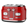
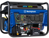
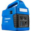
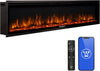
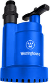
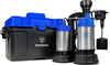
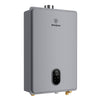
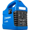
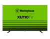
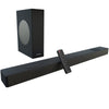
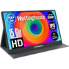
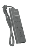
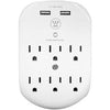
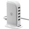
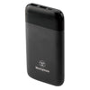
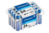
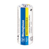
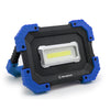
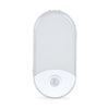
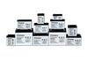
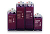
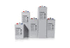
Circles, reminiscent of lights on a circuit board, a symbol from the original Westinghouse branding, have been thoughtfully integrated into the new website. They bring consistency and unity to various product photography, neatly encapsulating product types.
The parallel lines, another motif from the Paul Rand system, found a new purpose in the visual language. Originally enigmatic, they turned out to be a representation of the Westinghouse logo nestled between metal lines at the base of an escalator. Today, they are an integral part of the brand's visual identity, appearing on packaging, marketing materials, and the website.

Beyond the visual transformation, Westinghouse introduced a new brand platform that realigns its mission, vision, and values with its storied history of innovation. The brand's commitment to empowering people since 1886 is succinctly captured in a new tagline: "Powering People Since 1886."
Westinghouse is poised to continue its journey, embracing innovation, and staying true to the legacy that has powered generations. It's a tribute to the past and a promise for the future, where tradition and innovation unite to inspire the world.

